Anatomy of a Landing Page
As I touched on earlier this week, I recently started digging into Google Website Optimizer, and ran my first test a little over a week ago. I’m hoping to write about the process of using Google Website Optimizer very soon, but first, I wanted to write a post about the redesign of the LP.
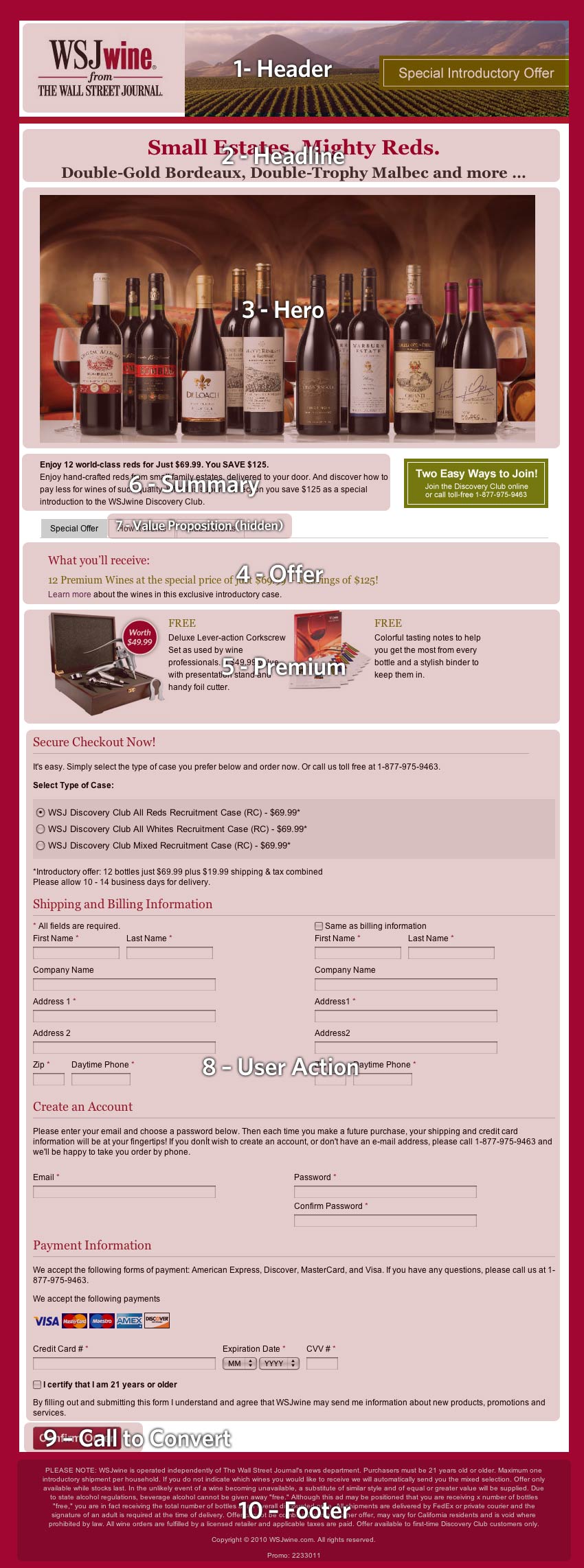
The first step I took in the redesign process was to break down and analyze the original (or “control”) page that I was tasked with redesigning. In doing this, I identified 10 distinct elements of the control page, which would be required on any new iterations of the page. Click here to view the full screen shot, and I’ve outlined the key elements below.
Control Page Outline:
1. Header
Topmost area of the page with brand logo
2. Headline
Typically the first and most visible statement of the offer or page title (tells the viewer the purpose of the page)
3. Hero
The “product shot”. This can be the product itself or a visual of someone using the product, or how the product works.
4. Offer
This is a more descriptive presentation of the offer (from the headline).
5. Premiums
Image and/or copy of the “premium” of free item when you order.
6. Summary
This is a short, easily digestible text block that explains why someone would want this offer.
7. Value Proposition
Additional supporting copy of what the product or offer is. Additional support and clarification of “why” the visitor should want to order. Note: Value propostion is initially “hidden” on this lp and requires user action to view content (pros and cons to this approach, particularly from a customer service standpoint)
8. User Action
In this case, it is the form the user must fill out in order to accept the offer.
9. Call to Convert or Call to Action (CTA)
In this case, it is the acceptance of the offer (after completion of the form).
10. Footer
The legal copy.
Please note: This is just a dissection of this particular LP. However, most LPs typically use a several or all of these elements. With LPs it’s common practice that “less is more”, and testing is the only way to truly know what will or won’t work for your LP (but that’s a whole different blog post).
In the next day or two, I’ll post a similar outline of the “new” creative, so you can see the differences, but in the meantime, I recommend you look at your own landing pages and break it into components (and see how yours compares to this list). I would love to hear your thoughts in the comments section.


